Friday, March 11, 2016
Vanely C- MK
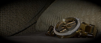
This picture was taken inside my house on the couch for the “about me” assignment last semester with my Galaxy Samsung camera 2. I edit this picture by adding contrast and lowering the brightness. I also made the edges darker so it would make the gold in the watch stand out more. It could be better if I knew the different techniques I know now because the watch would look better and also if there was more focus on the watch.
Subscribe to:
Post Comments (Atom)


1 comment:
Cool Image! I feel like the image would be a bit easier to see if the watch ere a bit brighter especially on the links of the watch. I also feel like a shallower depth of field would add more focus on the watch. I like the use of the rule of thirds that places the subject in a setting instead of just being an object. I feel like it would have been used more effectively if a different background was used. A couch isn’t very exciting so perhaps use a jewelry box or cabinet. I like this image because I really like the lens flares from the light reflecting off of the watch. Also it looks like a really cool watch. -Matt H-HHS
Post a Comment