Monday, April 29, 2013

Mylie U- Drowly Cow


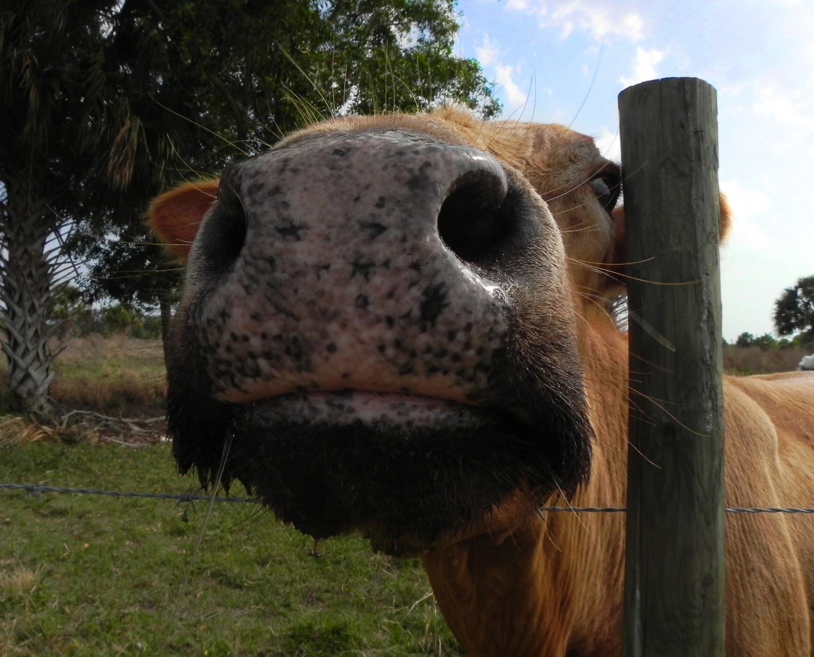
I took this picture at the bottom of Florida. I was at a farm with my grandmother. We fed the cows sweet potatoes and this one must have been real hungry. The cow had a piece of grass on her lip. I used the clone stamp to get it off. I used a saturation layer to make the sky and grass brighter. I like this picture because you can see the wetness on his nose.

Haley Y- Water Flower


I took this picture at my grand parents house planting flowers. I got my mom to water the flowers and I took a picture of it. I really like how the water and flower are in focus. When i edited this image i brightened the colors and cropped the picture. 

Jenna O - Subtle


Subtle was taken at Railroad Park. I changed the coloration of the picture and boosted and darkened the berry seeds. I tried to keep the tones really calm. I like the straight on formation because it is so subtle to the eye. I wish I would have manually focused better. 

Raven W- Calm Before the Storm


During spring break, me and my friends road tripped to Panama City Beach. I call this picture Calm Before the Storm because nobody was on the beach anymore, everybody was getting ready to walk the strip and get into trouble. To edit this picture, increased the exposure, contrast, saturation, definition, and sharpness, then decreased the highlights, shadows, and the de-noise options. 

Friday, April 26, 2013

Madison P- Spring


To edit this picture I adjusted the levels and changed it to black and white. My favorite part of the picture is the water drops and that they ended up being in such good focus on the flower. One thing I would have done to make this picture better is I would have tried to get closer to the flower when taking the picture instead of using the zoom and then cropping in even more because I feel like the photograph could have been sharper.

Ashley P - Candles & Matches


I took this picture of candles and matches for the composite project. I like this picture because of how orange it is and how the matches are so faded, but you can still see that one flame. I took this picture at home, I turned the lights off when I took the picture of the candles, but had them on for the matches. 

Danae A - Vibrant


I took this picture over Thanksgiving break. I love the clarity of the rose and the detail of the creases in my palm. 
To edit it, I increased the saturation of the flower to create the vibrance the picture is named for.

Ryan S- Sunrise


I titled this photo "Sunrise." I took this photo on top of Hidden Peak in Utah at a Sunrise Service on Easter. I like this photo because the view of the mountains are beautiful. I edited this photo by adjusting the brightness and contrast.

Wednesday, April 24, 2013

Johannes S- San Diego Skyline


This is an image of the San Diego skyline that I took over spring break. I cropped the image to focus completely on the buildings. Then, I altered the saturation and increased the contrast, especially on the blue colors in the image. I could have made the image better by zooming in more and using a better camera. Overall, I still think that it is good for the photoblog.

Rayna B- Spring


For this photo I denoised it and I brightened the flower and darkened the background. I really like it because It's a symbol of spring coming which is my favorite season of the year. 

Landry T- Turtle close up


I took the picture of the turtle sculpture by a turtle exhibit in my friends backyard. My camera cameo life in this picture and somehow produced an actual clear picture. I wanted to create an actual feel of the turtle coming out of the pot. I also anted to create a slight blur in the back ground and create the main focus on the turtle.

David M- White Flower Panorama


The title of my photo is White Flowers.  I wanted the branch entirely in focus so I used the image stacking technique and started at the top of the branch and went out to the end.  I edited the photo by filling in the top right and bottom left parts of the photo by taking other images of the flowers that I shot and putting their background into the stacked image's background.  I also needed to replicate the big tree branches near the bottom of the screen so I copied, rotated, and scaled them to fit right underneath.  Finally, I fixed a few errors where the twigs didn't line up and did a levels adjustment and I played with the Hue and Saturation of the photo.  I really like how this photo turned out and my favorite part is the bee that I caught on the middle flower.

Friday, April 19, 2013

Yesenia S - Isai


This is a picture of my brother Isai. I took this picture during spring break and I used it for the Choice 2 assignment. I chose this picture to put on the PhotoBLog because I thought it looked pretty cool how it turned out. This picture was edited by adjusting the Levels and the Selective Colors. I also added some brightness, contrast, and exposure. Overall, I liked how this picture turned out!.

Emily A- In Downtown Homewood


I am really proud of this panorama! This is a picture I took in downtown homewood one afternoon. It took a while to photograph because it is such a long building but I am really happy with how it turned out!! 

Ashley V- Vanish Point


I named it Vanish Point. I like this picture because its detailed and sharp. I choose this picture because it took a lot to get it due to trains almost hitting me. I enjoyed taking this picture because its at a different angle and it shows vanish point.

Tripp W- Devoid


I took this picture of a vacant space through a window near the super target. When I saw it, it made me feel empty, and kind of abandoned. So that was my goal in editing this; to try and translate that emotion. I increased the contrast and made the curves more dramatic. Then i adjusted the color balance. 

Thursday, April 18, 2013

Andrew L- Water Bottle


This is a photo of a water bottle that I took while I was bored on a car ride.  I took it in front of the light from the window with the tree line on the top of the water.  I edited this photo a good bit with color manipulation, highlight/shadow adjustment, and cropping.  This made the blue tent so vivid, and it made the background stand out.  I like the contrast that brought out the corners and ridges of the bottle.  This gave the photo an odd effect on the bottom, and I like it.

Amelia S-Architecture1


I took this picture for the architecture project. I edited it by adjusting the levels, curves, and brightness and contrast. I also cropped it down a little to focus more on the door knob. 

Alexis M- Pool Pano


This was taken at the Hoover Y in the bubble. I took a panorama and adjusted the curves.

Alex E- Downtown Bessemer


I took this picture in Downtown Bessemer. I used it for the architecture assignment a couple weeks ago. I felt that the editing really brought the picture to life with the different colors. I edited this picture with levels, a lot of curves, brightness/contrast, exposure, and the sharpening tool. 

Tuesday, April 16, 2013

Emily W- Red Plant


I took this picture over spring break at Callaway Gardens in Georgia. I adjusted the levels, brightness, contrast, and selective colors. 

Amber A- Pasta


This is the image of uncooked bow-tie pasta. To edit this image, I recolored the pasta to a bright purple and the plate to a lighter shade of teal. Also, I applied the glowing edges filter and combined it with the original image to create this picture. I really like this picture because of how the purple and blue look together. 

Abbey W- Palm Tree


The title of this image is called "Palm Tree". I took this photo of one of the leafs of the palm tree. I really like how it goes from really dark to a bright green almost yellow color in the leaf. I duplicated the layers several times changing it from normal to over lay and then to vivid. I also bumped up the saturation for the blue sky in the lower part of the picture and the dark greens in the center of the leaf. I really like how this turned image turned out but I really wish I was more aware of the building in the background and wish I would have taken the photo with out it being there. 

Josh V- Prince of Peace Panorama


The image I consider to be my best in the Architecture Assignment is my panorama of Prince of Peace. I really like the way it turned out. I was kind of worried how it would turn out because when I took it I made it really wide, so I didn't know how the photos would merge together. I like how I captured the chapel and the connection from the chapel to the back part of the church. One thing I could have changed was to remove the tree in the middle of the picture or stand in front of it.

Monday, April 15, 2013

Mariah M- Smash Journal


This is a picture of my SMASH* Journal that I edited. For this picture I used filters to do this, i really enjoy this picture. But this could be better if the color was a little brighter.

Mylie U- Rusty Bucket


This is a picture of a bucket that sits outset of my work. I took this for the choice project. I like it because it had jut rained the day before and there was a puddle on top of it. The rust is red and orange is beautiful.

Emily B- Firefighters2


I took this picture this weekend when we were at my house. I love all of the different colors in hue's in the firefighters uniforms and the firetrucks. I bumped up the contrast, used the burn tool around the edges, and used the cut out filter. I love the way it turned out!

Dkota W- Apples


I chose this picture for the photo blog because I really like it. I was originally just playing around with editing techniques during my free time in class but I turned out to really like it. When i edited this image I desaturated the entire image and darkened the background so the apples would stand out. I also use the Art History Brush to make the color of one of the apple to come back into the image but with a different look. Then I used the filter smudge stick so the other apples wouldn't look plain.

Jessica P- End of the Day (BBs)


It took this picture one evening as the sun was going down on our back porch, so I could get the long shadows behind each of the BBs, and get some of the texture from the wood.  I also used the dry brush filter on it.

Jordan M- Ripples


I took this photo "Ripples" for my still life assignment. The object is a drinking glass and I used my light source very close to it to get the ripples to show up with more contrast. In photoshop I cropped the image, increased the blue tint on the image and lightened some areas of the background.

Josh V- Hoover Baseball Composite


This was an image I edited for the Composite Assignment. I first used a picture of all my baseball equipment and duplicated the background and added a motion blur. Then I duplicated the background again and used a layer mask to get rid of some stuff from the motion blur. Then I added the Hoover H in the middle and also a picture of baseballs. Then I used the blending option to combine both images to the baseball equipment. Then finally I added a new layer and started painting orange around the helmet, and adjusted the levels to brighten up the image.

Nick E- Close Up Filtered


This is a photo i took for the close up assignment. Its of a wall fixture that resembles a flower, but I'm not sure exactly what it's called so i just left the title that i used for the assignment. I like the angle that it is shot at as well as the detail captured. the original color of the fixture was a dark pale green, but i edited it using a curves layer to make it sort of a pink color. 

Tuesday, April 9, 2013

Luiza L.- Jackson


I first edited this picture by changing the curves, then changing the color balance so that there was more blue and yellow in the picture than before. Then, I had to decrease the saturation of the picture so that it was not as green and lighten it as well so that the picture was not too bright or dark. After that, I went back and changed the curves again so that there would be more contrast between the light and dark parts of the picture. Overall, I like the picture, but I think it would have been better if the picture was not as green. If it were a little less green and lighter, it would look more authentic.

Johannes S- Money


This is an image of a couple of Dollar bills. I edited this image by adding a layer and deleting parts that were unimportant or not in focus. Furthermore, I changed the curves in order to make the colors look like this. Finally, I edited the brightness and contrast of the image. I used this image for the Close Up Assignment and I think that it is good for the photoblog. 

Stephanie P- Crayons


I took this picture for the close up assignment, i really like this picture. I got as close to the box of crayons as the camera would let me, i multiplied the layer and applied a filter.

Jay J- łöûíśvìłłë

Not statement provided

Reginald K- Coca Cola Bottle


This is a picture of an empty coca cola bottle. What i tried to do with this picture here, is give it a neon look like they have on their windows when they advertise it. I used the glowing edges filter first. Next thing i did was went to hue and saturation to change the color to red. And then i brightened it up some and sharpened the contrast. I'm overall happy with this photo.

Laura T- Dream Catcher


I took this picture of my dream catcher in my room that I have hanging on my bed. I love the beading on the dream catcher. To edit this photo I enhanced the color to bring out the different shades of the beads. I also cropped it so the picture was more focused on the art of the bead work. 

Danny J - Furby


This picture was taken of an old Furby at my house. I did not edit it at all because the light values couldn't be changed much and the picture was basically fine as it was. I love how majestic the Furby looks. 

Madison P- Soccer


I took this picture for the still life assignment. To edit the picture I boosted the contrast and saturation a little and adjusted the levels. My favorite part about the picture is the angle I took it at. I like how I got the grass in the front and the soccer ball and goalie glove fill up most of the picture. I also really like the colors of the picture because it reminds me of the fall. 

Katie W- Tiger


I took this picture of my cat, Tiger, one day before school. She was laying on the stairs as the sun was shining through the window on our front door. I really like how this image captures her whole body. I also like how her head is more in focus than the rest of her body. I edited this picture by playing with the levels and the curves. I also brightened the image and added a little contrast. If I could change one thing about this image it would be eliminating the shadow that is going across her body.

Mary L- Teddy Bear


This picture is from the still life assignment. I adjusted it by changing the shadow and highlights to it. Also I used the dodge and burn tool to make to folds darker and the teddy bear lighter. Overall I am pleased with this picture.

Ryan S-Bark


I called this picture "Bark." I took this picture up a tree in my backyard. I like this picture because the bark had good focus, and the lighting was really good for this picture. I also like how the sky is really blue. The one thing I would change about this photo is take out the one piece of bark that is in the foreground that is not in focus. But overall, I really like this picture. 

Thursday, April 4, 2013

Brianna B- Tan Atmosphere.


This is a photo of my mom's plant in my house. I like this photo because everything somewhat flows. I decided to take this picture because of the single item being separated from the other pieces. I did barely anything to nothing to edit this picture. The only thing I did was make the picture darker and some spots a tad bit lighter. 

Rayna B- Rigsby


This is a picture I took of Mr. Rigsby in class for the closeup assignment. I really like the way it turned out. I just retouched a few things and used the water color effect. I also brightened it a little bit. If I could change one thing about it it would probably to make it a little softer. 

Justin H-Barricade


I created this photo in the composite image assignment. I really like this photo because all of the photos I put together blended very well. I really like the filters I used too. It is called Barricade because The picture looks kind of like a fence. The trees also make a long wall.

Emily W- Wrapped Skull


I took this picture during the still life assignment. I adjusted the levels, curves, and the brightness and contrast. I tried to bring out the detail in the wrapping that was on the skeleton. It's kinda weird but also awesome looking.

Tuesday, April 2, 2013

Arisha L- Duct Tape Rose


I took this picture in my room of a duct tape rose I made in creative crafts. This was my favorite rose because it was really colorful and it looked really pretty. I added lots of filter and layers and I also decreased the brightness just a little. I really like the way this picture turned out!

Monday, April 1, 2013

Jennifer L- Untitled

No statement provided.

Landry T.-Champion


This is a picture of the state ring. THE STATE RING. I took this picture in the classroom and added a slight blur.