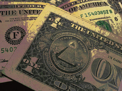
This is an image of a couple of Dollar bills. I edited this image by adding a layer and deleting parts that were unimportant or not in focus. Furthermore, I changed the curves in order to make the colors look like this. Finally, I edited the brightness and contrast of the image. I used this image for the Close Up Assignment and I think that it is good for the photoblog.
Tuesday, April 9, 2013
Subscribe to:
Post Comments (Atom)


7 comments:
Cool Photo! I really like how the filter you added to this photo because it gives a pictorialist feel to the photo. If by deleting you mean cropping I like how you did that as well. I really like how the center of the photo is the pyramid on the dollar bill closest to the camera. To me, the most interesting part of a bill is the pyramid, and I like how that stands out. I also like how there appears to be more than two dollar bills, which adds the "stacking" quality of the subject(s). Overall, Great Job.
-Abhay T-HHS
This is a really good photo. The filter that was added really makes the picture. It shows the details of each dollar bill.
- Jay J-HHS
Johannes,
I think this is a great shot!! They way you edited it really makes it. Also, the image is very clean and crisping, creating a vibrant sharpness.
Well done,
Ashley C-HHS
Like it, good close up shot of money! Very good editing of the color combo, like the decreased brightness. Very well edited, good photo overall.
i really like this picture. i like how simple it is yet but the way you edited makes it interested. i also really like the leading lines in this picture.
HHS- Maia S
I really like this picture. The way you edited it makes it look really interesting. The brightness and contrast is prefect too! It's also focused really well. You did a great job! Keep it up!
Arisha L-HHS
Post a Comment