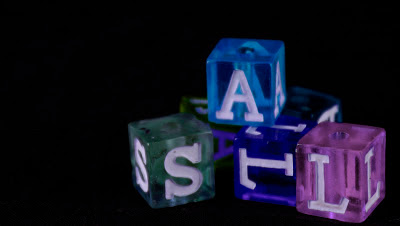
I took this photo with the black backdrop in Mr. Rigsby's class. I changed the colors of the blocks into darker colors. I wanted to make this picture better by getting rid of the grain that you can see on the blocks.
Monday, March 11, 2013
Subscribe to:
Post Comments (Atom)


4 comments:
This picture is really neat. I love how you used the rule of thirds and put the blocks in the third, one third. I also really like how the colors pop against the black background. The blocks are also in focus. Overall you did a nice job.
Kayla B.-HHS
I like that this picture is really different. I like how the blocks are see-through. I like that the black background makes the colors even more noticeable.
Amelia S- HHS
I really like this picture. The rule of thirds is executed very well, and the composition of the image is ideal. I couldnt even see the grain until you mentioned it. And even then, it looks deliberate. Overall, it's very nice.
Tripp W. -HHS
You did a good job with this picture, I really like how you made the background black. I also like the colors of the blocks and how you made the color darker. this is a really cool picture
Post a Comment