Tuesday, October 13, 2015
Briley S- Land of the Free
Subscribe to:
Post Comments (Atom)

Welcome to the Hoover High Digital Photo Blog. Here you can see images and comments by Digital Photo students at Hoover High School. The blog will be updated daily so check back to see whats new.
12 comments:
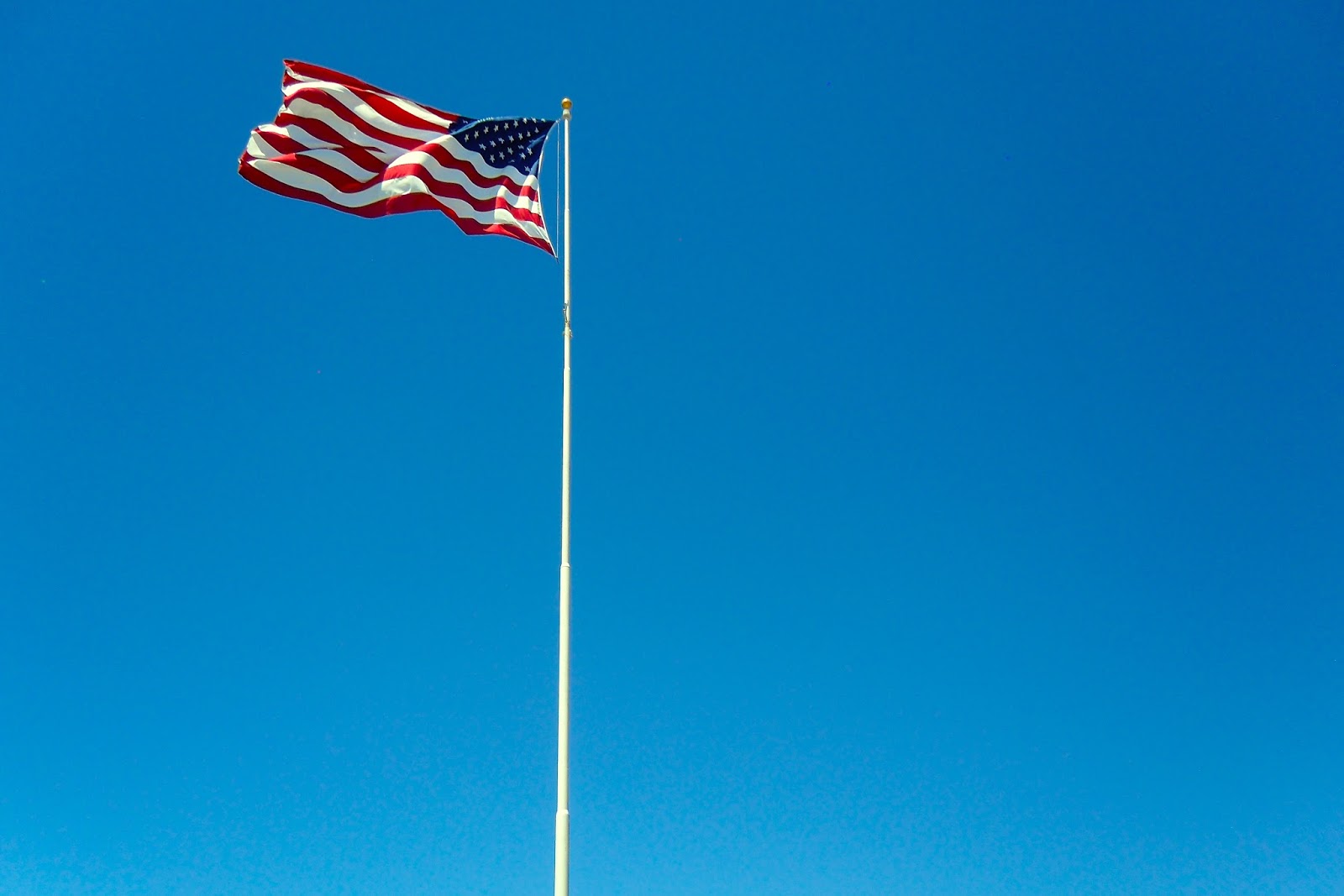
I really like this picture and how you captured the flag fling in the wind. The solid blue color in the background really helps show the flag and makes the flag stand out more. You might could have cropped on the flag a little more but over all it is very good.
Tanner R.
Riley, I really appreciate the color scheme at work here. The reds of the flag stand out really well against the blues of the sky and the whites of the pole. But I will agree that some trees or, preferably, some clouds would help to break up the single-tone blue background. One possible suggestion to this could be to crop closer to the subject, eliminating a lot of the negative space in the shot. This solution isn’t really that necessary though, because the shot is, as cropped now, still charming and fully functional. If you do decide to crop it however, try to leave space to the left (from our POV) of the flag, as that allows room for the perceived motion to feel balanced for the viewer. Thanks for (maybe) reading Briley.
This is a cool picture because it is simple and complex at the same time. There is no confusion about the subject and it is cool how the colors of the flag pop off the sky in the background. The colors are very sharp and the brightness of the picture is just right. The only thing that I would have done differently is crop it a little more so that the flag is closer to the center of the photo.
Jacob C- HHS
I like this photo with just the flag in it which makes a really bold statement. iI love the quality of it and how the flag is kind of off center which adds a lot of depth to the photo. The flag really adds a good pop of color to the blue sky and the sharpness is amazing! I would totally hang this on my wall!
Ella P- HHS
I really like how clear this picture is, you can see all the waves in the flag. Next time you could try to use the rule of thirds because its a little to the side. I really like how the sky is so blue. It makes me very proud of our country.
Molly B-HHS
I like this picture. You made it easy to focus on the subject in this picture with solid blue sky because there are no distractions from the subject. You applied the Rule of Thrids nicely by not centering the flag. However, I do agree it would have been better if there were clouds or trees. Overall, I like this picture.
Nicole T-HHS
Nice Job! This picture is really nice. I really like the lighting in this picture because it makes the flag really pop and stand out. I really like how this photo was cropped because the flag does not take up all of the space and neither does the sky. I really like this photo and hat is represents and thought you did a great job!
Seth W
This picture is really cool! I like how the sky is solid blue so it really makes the flag stand out against it. I think the flag in the upper left draws your eye to the flag and you did a great job doing that. The primary pictures look good with each other too! I really like this picture and think you did a great job captures the waving of the flag and making it such a statement.
-Maison R- HHS
This picture has great color in both the flag and the sky. I really like how you can see the movement of the flag. It might've been better if there were more trees or something in the background so there'd be more depth. Also it might've been better if the flag was centered and cropped. But overall I really like this picture.
I like this picture because it just has the flag in it. The lighting in this is perfect. I like how you used the rule of thirds in this because the flag is not just right in the middle. The blue sky in the background really makes the flag stick out. I really like this picture andI would definitely hang it on my wall.
Annemarie Kacker- HHS
Nice photo. The flag is positioned in a way so that it seems dynamic, applying the rule of thirds. The background is overly simplistic, so a change to that could've helped. The picture has a good patriotic feel to it, but the flag could be little bit more visible and closer. Overall nice photo.
Jonathan T. - HHS
I really like this photo. I like how you can see the waves in the flag. The color of the sky really brings out the picture. I also like the brightness of the picture. Great job! -Katie R
Post a Comment