Welcome to the Hoover High Digital Photo Blog.
Here you can see images and comments by Digital Photo students at Hoover High School. The blog will be updated daily so check back to see whats new.
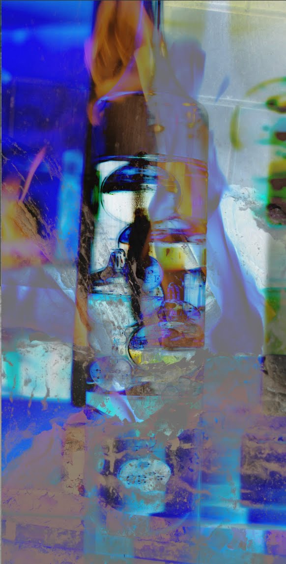
I named this composite Blue Fire because of the color that it gives off. I took all the images from this composite at the Brookwood Mall. I also took this with my camera and edited it in Photoshop.
7 comments:
Anonymous
said...
I like the exposure of this photo because it is mixed where some of the composite images are overexposed and others are underexposed in order to have a complete image in balance. I also like the dark vs. light areas in this image because some images seem to light overlay the darker ones. I like the story of this photo because if you had not said it was Brookwood Mall, I would have had no idea.
I like the way this picture looks. It looks as if it belongs in an art museum. The blue contrasting the orange of the fire brings about a nice attitude from the picture.
Wow. This picture has so much detail. Its almost confusing, had me thinking what i was looking at. The reflection in the glass (at least that is what i think it is) is so unique and provokes emotion. I love it amazing edits!

7 comments:
I like the exposure of this photo because it is mixed where some of the composite images are overexposed and others are underexposed in order to have a complete image in balance. I also like the dark vs. light areas in this image because some images seem to light overlay the darker ones. I like the story of this photo because if you had not said it was Brookwood Mall, I would have had no idea.
I like the way this picture looks. It looks as if it belongs in an art museum. The blue contrasting the orange of the fire brings about a nice attitude from the picture.
Nicholas L.
I love this picture! The colors and look of it is very cool! Overall, I wouldn't change anything! Good job! -Emily R HHS
Wow. This picture has so much detail. Its almost confusing, had me thinking what i was looking at. The reflection in the glass (at least that is what i think it is) is so unique and provokes emotion. I love it amazing edits!
this is a cool picture. I'm not exactly sure whats going on in the picture but I like that it keeps me guessing. I like the mixture of the colors.
I really like this picture. I like all the color and how you edited it.
It's a bit hard to determine what exactly this is but, it is pretty cool. I really like the mixture of colors.
Post a Comment