Monday, October 15, 2018
Grace R- Light Reading
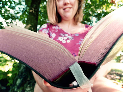
The title of this image is “Light Reading.” This was taken in a park on September 16 in the afternoon. It was taken with my Panasonic DMC-FZ70. I edited it first in Photos and then used Photoshop to remove a dark shadow from her face. I think the picture would be better if there were less dark shadows and if the pages of the book were more in focus. I like this picture because of the contrasting colors and also the personality it captures. This is my sister reading one of her favorite books and I love the smile she’s making. I called the picture “Light Reading” because she loves old, long books. She’ll take them anywhere, even the park or the beach, so to her, any book is a light read. The title also refers to the bright, sunny day this picture was taken on.
Subscribe to:
Post Comments (Atom)


4 comments:
I like how the book is the main focus in the picture the color of the pages really compliments it i like the blurred background to to make sure the picture stands out to the viewer.
I really love this photo and how clear it is! I love how its clear that the main point is the book and then you have the individual in the background. I also love how bright the colors are and the nature look it gives. If I would change anything it would be the angle of the individuals hands holding the book, but other than that it's an awesome photo! -Megan C-HHS
I love the perspective of this photo as well as the subject. I think the only thing I would change would be clean up the hair around the face a bit and maybe if she was looking up a little more, but I love the title and overall composition of this photo! -Lauren B HHS
I really like this photo! I think the perspective that it was taken from adds a lot to it. I really like the colors in it and how the book pages are tinted. The way the focus is on the book and you can see the person blurred in the background makes it look really cool!
Post a Comment