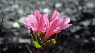
I took this picture in my front yard early one morning before work. Originally I had decided to not edit the picture at all because of the way it looked straight off the camera. I then decided to split the subject and the background into two layers and edit each separately. For the background I darkened the image and also changed the color balance to make it more green and blue. For the flower, I increased the red tints as well as increasing the Contrast.
Monday, May 13, 2013
Subscribe to:
Post Comments (Atom)


7 comments:
I love this picture. I love how the background is pixelated and dull while the flower is vibrant and focused. Making the background dull really makes the flower stand out even more. The colors are great. The picture is very clear and ever aspect is in focus. GREAT JOB
Dkota W-HHS
This is a really cool image. Love the detailing of the pink petals.
this is a good picture. the pink stands out to me. i like how the background is black and white. i also like how all the focus is on the flower
I love this picture. I love how sharp the flower looks. I also like the colors on the flower especially against the dark background. You did an awesome job editing!
Laura T. HHS
Wow, this is a really cool photo. I especially like the focus that is used in this photo. I like how the subject of the photo, which is the flower, is in focus while the rest of the picture (aka background) is blurred out. This helps add more emphasis on the subject of the picture. I also really like the color scheme that is used in this picture. The flower is given a soft pink color while the background is make black/white. This really helps the subject stand out from the rest of the picture. I also like the fact that you have put the subject in the center of the picture. The subject would not have looked good on a third. Overall, this is a very good picture. Good Job!
-Hemin N.-HHS
The softer lighting of the picture works really well to capture the details in the flowers and leaves. The coloring of the flower against the black and white background creates a nice contrast and brings the attention of the picture to the flower. Overall, I really like this picture because it looks like a blend between an actual photograph and a painting.
Luiza L.- HHS
I really like this photo. I like the colors that are in this. The background also looks really cool! Overall this is a really good picture. There isnt anything that i would change about this.
Jennifer L-HHS
Post a Comment