
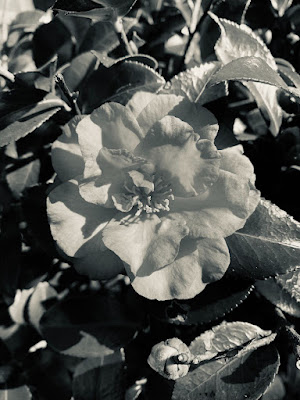
I took this image at school and just like another image I posted I put it in black and white to bring out more detail. The flower was white and I didn’t really think it looked good with the dark green leaves. I like the lighting in it but there are a few spots with the leaves that are a little bit too blurry. I think the flower looks pretty much perfect with the position and lighting, but I do admit that there should be a few more things in the background to make it look better or maybe not. That’s just what I think. It was pretty well done and I’m happy with it.
3 comments:
This photo is good enough. The picture has great composition, but I think the editing killed it. The black and white makes it very dull in my opinion. Bring some color and life into it, that would make it pop much more. Putting a little more work into the dining would make this a pretty good picture.
BB -HHS
This is a good image, I really like all the different elements of image. However I think everything in the image mixes together, so nothing really stands out. I think if you still wanted black and white you could have added more contrast, like making the background darker, or personally I would have left it in color. I think the sunlight in the image makes everything appear the same tone. This image has good potential if you changed the editing a little bit.
-Sophia C. HHS
i like this picture because i love the flower, and the the filter its good with this picture.
Post a Comment