
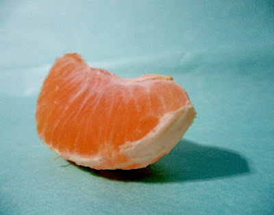
This picture is called Citrus. I took the picture at my house in January this year with my Canon Elph 180. I increased the saturation and contrast on the orange and decreased the brightness a bit to make the orange color deeper. I also increased the pink and red colors in the orange to bring out its color more. I also increased the green and blue in the background to give it more of a turquoise color. The only thing I wish I could have done differently is to make the background look smoother and get rid of some of the creases in the background so the focus would be more on the orange.
2 comments:
I love your picture! I love the contrast between the orange and the blue. I also really like how you can see the little details in the orange. I also love how vibrant and colorful the orange is. The DOF is shallow, which is nice. I like the lighting of your picture. I would probably sharpen up the edges of the orange so that the orange isn't blurry against the background. Overall, I really love your picture and think this is great!
L.W.- HHS
I really like this image! I love the colors and how they work together. The orange and turquoise contrast one another very well. I also like how the light source is to one side of the orange so it creates a nice shadow. I think that the image could be a little bit sharper, but other than that I think it's great! Good work! -Ella F.
Post a Comment