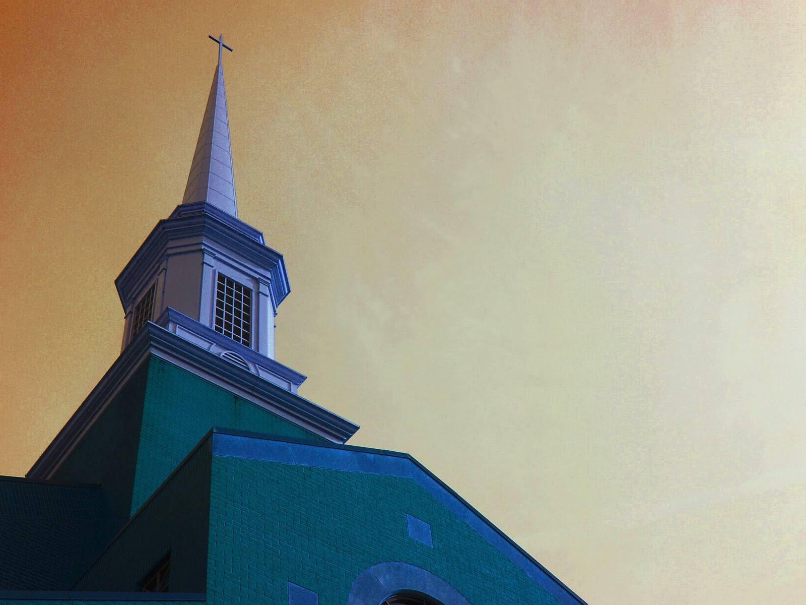
The title of this image is “Painted Church.”
This photo was taken of the steeple at Hunter Street Baptist Church. I wanted to do something a little different and give the photo a look that makes it appear to be drawn or painted, resulting in the given title. i adjusted the hue/saturation to give the building the bluish green color and to make the sky have several shades of white, yellow, and orange. i also brought up the contrast to make the picture look more grainy in some areas, just to top off the painted look i was going for.
Wednesday, February 11, 2015
Subscribe to:
Post Comments (Atom)


5 comments:
I love this picture. It has an unrealistic feel to it and I really like it. I love the color of the sky and how the church looks blue. I wouldn't change anything about it, I really love it.
-Abbey Smith HHS
I love this picture! I love the subtle tones of the colors. Also I really like your use of the Rule of Thirds because it adds more intrigue to your image. Great job on this picture!!
- Elizabeth R.-HHS
I like this picture! The shades of blue are very complimentary to each other and the way the yellow fades out is very nice. Overall a great shot!
Erin R - HHS
I really like this image. I like how you took a risk and played with the different features of photoshop to get the result you were looking for. I feel like you've accomplished your goal by making your photo look like a drawing. I also really like the color contrast between the church and the sky.
HHS-Emily D
I really like looking at this picture. The way you edited it makes it really look like a painting. I love how the sky os orange and then the church looks green. I think the exposure is perfect because you can see where the sun is poking through on the right half of the picture. I also really like how the church isn't centered.
Post a Comment