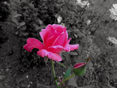
I titled the picture "Rose and Bud." I took it in my front yard on October 2nd with my iPhone 4s. I edited by enhancing it, contrasting it, sharpening it, and saturating it. I made the picture black and white, and then I redid the coloring of the rose. I also changed the levels of the picture, and I adjusted the toning. I really like the way the rose stands out so that it is the only object attracting attention. I would not change anything about it.
Friday, November 8, 2013
Subscribe to:
Post Comments (Atom)


2 comments:
I really like the soft focus on the single flower. i think its appropriate for the situation. I like how you made the picture black and white but then went back to the original color of the flower. Overall i really like this picture.
Kelley M-HHS
I really like how this picture is focusing on the flower, especially because the color is nice and bright.
I like how the edges of the flower don't blend in with the black and white, it stands out.
and I also like how the flower looks smooth but the background is rough.
I really like this picture.
Zoya D. HHS
Post a Comment