Monday, May 6, 2019
Hudson C- Wings
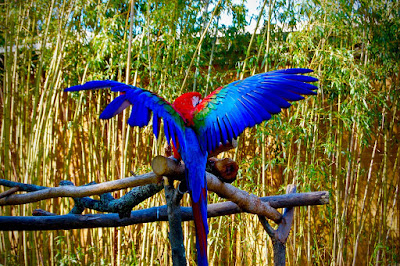
I took this photo on the zoo trip we took. I had my burst mode on when the bird was stretching its wings and this was the photo I had where its wings were most out. I wish I was directly behind the bird so you could see both wings more clearly, it could also be a little more focused. I just edited it in the photos app and in photoshop to sharpen colors and make it a little clearer.
Subscribe to:
Post Comments (Atom)


9 comments:
I like the lighting of this image, it is very bright which makes the color more visible. I like the tonal range of this image because there is mainly 3-4 colors that are the main focus which are red, green, blue, and a slight yellow. The colors are very vivid and saturated. I like the story of this image because it allows the person viewing it to understand how you got its wings spread out through burst mode.
I like the saturation and its effects on the image. It brightens the red, green, and especially the blue, and I think it really brings out the focus of the bird onto the overall picture. The only thing I would change is to crop it so you can get a little less of the yellow and green background. It's really cool and unique that you were able to capture its wings out like that, it gives out a powerful vibe.
I love how you made the colors pop to make the bird center of attention. The background plays along with the picture. The colorway of it is so cool.
The Bird looks nice, but the bamboo looks a little to vibrant.
Chris R
I really love this photo! Perfect timing by the way. The saturation is a little too much on the bird itself. The blue feathers almost change to a purple it looks like. If you added a little definition it might not look so bad. The detail already is amazing though.
This immediately caught my eye. How perfect you caught the movements and how well it stands out. The coloration is wonderful and I like how bright it is in the back. Allowing a lot of light & dark contrast as well. Really well done, great job.
I like the saturation and its effects on the image. It brightens the red, green, and especially the blue. The only thing I would change is to crop it so you can get a little less of the yellow and green background.
I like the definition of the feathers. The photo is already perfect, but the only thing that iI would change is the saturation because the blue looks purple. I also like the sharpness of the tree, it looks very realistic. overall, the photograph is perfect I would just lower the saturation.
Taha M HHS
This picture is good but I feel like if the light was more on the bird than in the background would have been better. I think this would be better because it would bring out the color of the wings. It also seems like the focus was on the wood more than the bird. I do like that most of the wood directs your eyes to the bird. I like the photo and like that when I look at it, it makes me feel happy.
Post a Comment