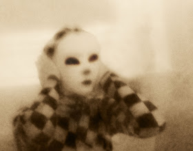
This picture is titled "Elizabeth". I took it of my sister when she was in a giant balloon. I edited it by cropping it so that the viewer can not see the balloon. I also increased the contrast and changed the brightness. I like how you can see the individual pixels in the particular image, giving it an older feel.


I really like this photo. It has a very eerie aesthetic, complimented by the noisiness and sepia filter. Although usually the low quality would detract from a photo, it really fits with the subject. Great job.
ReplyDeleteCole G - HHS
The more i look at this the more i like it. At first i didn't like that much, but after i read the description and realized that it is meant to look like this, i really started liking it. I think that you did a good job on this!
ReplyDelete-Stephanie P- HHS
Oh my gosh! when I first saw this I was kind of like... what?! what is that?! It looks kind of like a clown at a circus, but It is an awesome picture! The way you edited this picture is really cool! I really enjoy the sepia and the kind of blurryness. It is really interesting! It is kind of scary if you are just scrowling down... but when I went up to see what the picture actually is, it is really cool! This is so awesome! and a very great Picture! I LOVE IT!!!
ReplyDelete~Mariah M.-HHS
Cool Photo. I really like the softness around the subject, and the contrast of colors really adds to the cool effect of the photo. I too like the individual pixels in the photo that gives the nice effect to the subject. I also like the photo is centered, and follows the Rule of Thirds. I also like the difference of brightness from the top and bottom of the photo, where the top is bright, and the bottom is dark. Again, Great Job!
ReplyDelete-Abhay T-HHS